Tuesday, November 23, 2010

LOOK - The Series, Production Design


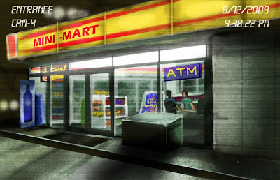
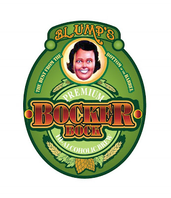
Police gear, body parts, bodily fluids, food labels, smashed guitars, drugs & drug paraphernalia, schoolbooks, signs, paintballs, U.S. Army gear, purses, knives, homeless shopping carts, sex toys...

VIEW CLIPS HERE


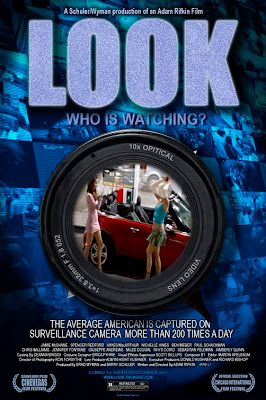
Based on the multiple award-winning indie film of the same name, LOOK - The Series, by writer/director Adam Rifkin, is an incredibly insightful, unsettling and entertaining view of modern life, shot entirely from the perspective of security and surveillance cameras. We've all seen the jaw-dropping footage of crazy things average people do when they don't think anyone is watching. But in this day and age, when there are over 30 million surveillance cameras in the U.S., and the average person is photographed 200 times a day, could that jaw-dropping footage include us?

This was an incredibly challenging project. We broke a lot of new ground and I was honored to be on board. It was shot as if it were an independent film, with all 11 episodes of our first season taped at the same time. We were able to cover approximately 240 pages in 21 days. At times, I had to be three places at once.
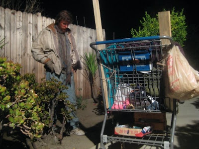

(photo: Genevieve Garner)

This show is making quite a stir and has become a ratings leader in late night programming. It really captures the global technological zeitgeist, blending it with car-wreck entertainment and skillful verité.

(I also have a cameo.)

Tuesday, August 3, 2010

There Be Monsters...


I've just finished principal photography on a short film (one of four to be compiled in a feature length anthology a la Creepshow), and I hope to post a few set pics as soon as I'm allowed. I worked very early with the director on concept art for FX shots, and storyboards for action sequences. We knew it was going to be a tight shoot so we wanted to give the DP and FX team a really firm idea of movement and tone.


The film is a spoof of 1950s Atomic Age monster movies, and was great fun to help develop. It was tough and very fun all studio shoot. I got to build 1950s styled sets, which I loved. Details to come. (We have two location days and one FX day to shoot yet as of this writing.)


I worked with an entirely new crew this time and they were fantastic. When I came on board one of the four segments was already shooting. I decided to keep the same art department crew from that segment for mine and I've suggested to the producers that we bring them back for the others as well. Keeps consistency, keeps good people working.


One of the best parts of this show are the FX, the Chiodo brothers, who made an AMAZING puppet interpretation of the monster from my storyboards. SO exciting.

Thursday, March 18, 2010

For No Eyes Only

This is my first post unaccompanied by an image because, well... I can't post any. I've been very busy the past several months on a few projects that are covered by serious NDSs - Non-Disclosure Agreements. I've been designing, producing, writing and even acting.

Why the NDAs? A couple of these are government related projects. No disclosure until they say. The others are simply about cautious development deals. Now, these projects aren't critical to national security or anything, so I can at least talk about the fact that I've participated in something. But, no details.

On the other hand, there have been a couple of great projects I can talk about:
- Conservation International: Production Design for this great global environmental group

- Victory Theater Center - I was set designer for the excellent production of the Brett Neveu play "Old Glory" directed by Carri Coffman-Sullens for the Victory Theater Center in Burbank; so far the production has been really well received and I'm very proud of the work.

Check them out.

Thursday, August 6, 2009

Path Of Miracles, Multimedia Design

I loved this project:


I was asked by world-renowned choral director Donald Nally to create a presentation to accompany his first concert of Joby Talbot's "Path Of Miracles", and amazing and complex a cappella choral piece depicting the pilgrim's journey of the path of St. James.

It was originally conceived as projected on two areas above the heads and to the sides of Nally's Crossing Choir. When I arrived in Philadelphia I took one look at the space and knew it had to be bigger. Donald agreed and we were able to project right down the middle across the entire chancel wall. We made these changes wthout the benefit of a full tech rehearsal (due to an unfortunate scheduling error by the facility) and I spent most of the night before and the day of the performance rewriting all 300+ cues to fit the new configuration.

It was a success, receiving much acclaim from the audience, yet I believe we can do better next time. And Donald has promised there will be another opportunity. This will allow me to refine some of the video elements that didn't quite work this first time around.

Illustration - Film Titles Element


A painted element to be used in a titles sequence for Smokin' Aces @: Blowback. A Universal film. Client: Identity Studios, Los Angeles.

After initial work as concept designer for the action film title sequence, Identity Studios called me back in to illustrate this key element. A house of cards theme had been developed and they wanted to have something very sharp and sinister to cap off the sequence, to be animated with other 3D/2D elements.

Titles Concept, Feature Film

These are concept boards for an animated title sequence of Smokin' Aces 2: Blowback. Studio: Universal. Client: Identity Studios, Los Angeles. Project:TBA


I did a series of these boards in varying detail as a jumping-off point for the animators and artists who would create the final titles sequence. They wanted unfolding layers and a house-of-cards theme. This shows some of the main elements, plus a color palette and direction for texture. I was hired for initial concepts only, to get direction for the post team. Final credit style was developed by the post artists.


Concept Art, Feature Film

A concept piece for an indie Sci-Fi film, Client: Identity Studios, Los Angeles


This was used to visualize a key scene from the film using an existing location. An idea, for the filmmakers to nail down mood and style in the early planning phases.